These font choices are just terrible! Check out these hilarious pictures and share the laughs with everyone who could use a reason to smile today.
Oh. My. God. I laughed so hard making this gallery! These 20 hilarious pictures are proof that it doesn’t just matter WHAT you write, but also HOW you write it. The font. The spacing between letters. The placement. And after you’re done writing it, check it one more time before you send it to production. Because the results can be seriously NSFW.
1. Yeah, I know it says 'tarts', but my brain wants to see 'farts'.

2. I love cow...?

3. This font fail is hilarious!

4. "We light the halls with our education." If only they had chosen a different font...

5. How could they not see it? How?

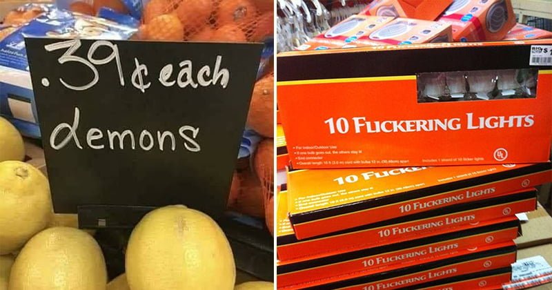
6. This person's handwriting made me think they're selling demons at the store!

7. Hahaha! This one's hilarious:

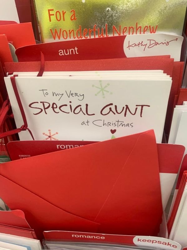
8. There are so many nice fonts that are more than perfect to write the word Aunt, yet some people keep choosing fonts like this one.
9. They should've chosen a different font to write 'Flickering Lights'

10. I wanna believe they meant to write FIT FOREVER, but I think we can all agree this is the opposite.

11. Is is Fast Taco? Is it Fart Taco? We'll never know.

12. This is an epic design fail:

13. What?! KKKBOXING?
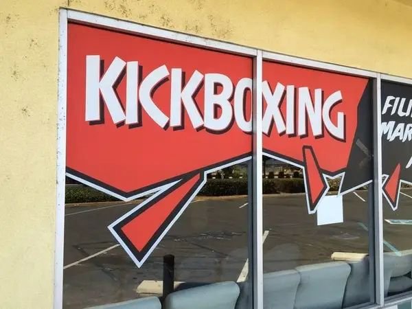
14. Super what? I wouldn't wear this, lol:

15. A nice guide on how to trap a fairy...

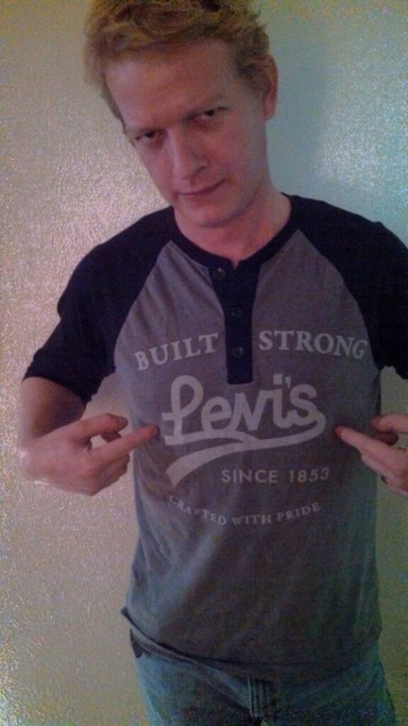
16. The font choice on this Levi's t-shirt...
17. I say we should all stop writing the word 'flick' in all caps.

18. I think whoever designed this wanted to pull a prank on 'click lovers'. Seriously, how can you not see it?

19. Tubes? Pubes? Hmm...

20. Welcome to BULL TITAN US.

If you enjoyed this funny article, check out some more awesome jokes and hilarious stories here.
We’d love to keep in touch! Follow us on our Bouncy Mustard Facebook Page and join our Smile While You Still Have Teeth humor group for more fun posts.

